Digital Storytelling

The Center of the Image- more examples

 
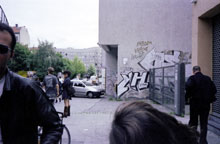
Image a shows an example of a badly composed image. The center is empty, and attention is directed away from it - everybody is looking somewhere else, or is too close to the frame.
image a

Image b uses a strong center, with the object of attention standing slightly off center. In general completely centric or evenly divided images seem static and boring; however, if there are too many elements in no kind of order, the image may seem chaotic and confusing.

image b
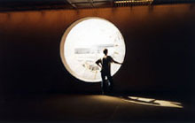
Image c has a few centers, but their hierarchy isn't clear. Therefore, the viewer isn't sure whether they should be paying attention to the street signs, or to the woman rummaging in her handbag.
image c