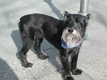
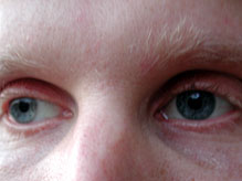
Images c and d illustrate what happens when you put the most
important part of the image dead center instead of into the lower
or
upper third (in addition to using a bad camera angle in the dog image,
and having too tight a frame in the picture of the man's eyes.) In image
c
you see the dog, but you don't know why - the dog is not in action,
it's not looking somewhere else or going anywhere.
Image
d lets the viewer wonder why you see this person's eyes
- since they are almost cropped, you are not sure whether they
are really important
or not, nor do you have a sense of where/what he is looking at.