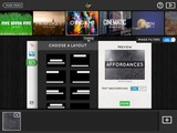
The slides for my Friday workshop in Canberra at the 2013 AIS ICT Management and Leadership Conference are now online:
Month: May 2013
Paths to Technology Integration: SAMR & TPCK in Context
The slides for my keynote presentation in Canberra at the 2013 AIS ICT Management and Leadership Conference are now online:
Putting the Horizon Report to Work
The slides for my Thursday workshop in Canberra at the 2013 AIS ICT Management and Leadership Conference are now online:
Putting the Horizon Report to Work
The NMC Horizon EdTech Weekly App for smartphones and tablets can be found at the following links:
SAMR: Moving from Enhancement to Transformation
The slides for my Wednesday workshop in Canberra at the 2013 AIS ICT Management and Leadership Conference are now online:
Taking Mobile Mountain
An interesting phenomenon that has accompanied the rise of mobile devices is a rethinking and revitalized exploration of key elements of human interface design. Many people have misread this as a “dumbing down” of apps, due to the lower availability of computational power on smartphones and tablets; this is definitely not the case. An iPad today is as powerful as the computers I ran Final Cut Pro, Photoshop, and Mathematica on not that long ago. Given this, the real question is not what can an app do, but rather what should it do. It is easy to avoid tough decisions about what features to include on desktop and laptop machines – just keep on doing what you’ve been doing all along, even if it never worked all that well to begin with. The new opportunities and usage environments afforded by mobile devices mean that making the same choices will at best miss possibilities for leaps forward, at worst seriously interfere with the usability of the device. Navigating endless hierarchical menus plus associated dialog boxes is already a waste of time on traditional devices; on mobile devices it becomes an impossible task.
Fortunately, several developers have risen to the challenge of carefully selecting the 80% of features that are crucial to the execution of a task, then framing them in the context of an interface that makes them accessible and evident. Automation of secondary aspects of a task also plays a key role here: we gain little from our use of technology if digital busywork replaces its paper counterpart. Those of us that work in education can learn from studying these new approaches, including the fact that many of these apps stress elegant design and enjoyable experiences. If we want our students to create more frequently and across a wider range of disciplines with mobile devices than they have with more traditional computing tools – and I would strongly argue that this should be one of our goals – then providing them tools that are a pleasure to use is a key component of this strategy. Here are three apps that exemplify particular approaches – with apologies to Brian Eno, I’ll refer to each as a variation on Taking Tiger Mountain (By Strategy):
Taking Mobile Mountain (By Simplicity)
 Far too many traditional software tools are laden with features that only 20% of the users will need 20% of the time, making the crucial feature set hard to find, needlessly complex, and slow to use. By contrast, focusing on a minimal feature set that 80% of the users will want 80% of the time, and automating the rest, can lead to agile and powerful results. Haiku Deck exemplifies this beautifully in the presentation software domain. Your task is to focus on the content you wish to convey and the images that will best illustrate it – and Haiku Deck takes care of the rest. Would you like to set pages and pages of text on a single slide in 6-point Comic Sans, just so you can see your audience weep? Sorry – you’ll have to look elsewhere – Haiku Deck’s design smarts won’t allow that. On the other hand, would you like to have Creative Commons images easily located for illustration, with authorship credited properly and automatically? Haiku Deck will happily handle this. It is important to distinguish this approach from the “wizards” found in many traditional apps (see the late and not-so-lamented Clippy for an example): the latter are a half-hearted attempt to cover up complexity with inadequate default options.
Also see: iA Writer, an app that focuses on the barebones essentials that writers need for their craft – it’s what I use to write these blog posts (and pretty much everything else) these days.
Taking Mobile Mountain (By Abstraction)
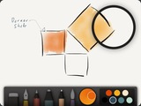 Another approach is to focus on the idea behind the toolset for a task you might want to accomplish, and abstract its key features, distilling it into a conceptually refined form. Painting and drawing apps are popular on the iPad, and many of them take an approach to natural media simulation that is derived from Painter, the granddaddy of the field. These apps provide a huge set of parameters for tweaking media, brush, and canvas simulations, controlled by correspondingly large numbers of palettes, sliders, and choosers. But what if you instead took a step back, and tried to create an idealized pen, watercolor wash, marker, etc. with a single set of settings and likewise idealized behaviors? The result would be akin to Paper by FiftyThree. No watercolor brush ever behaved like the one in Paper – but the idea of a watercolor brush might. The color mixer in Paper does not model realistically what would happen in a physical paint pot – but it does correspond to a logical abstraction from the process that is also very different from a traditional color picker. The programming team has added features very slowly to Paper – a magnifying loupe only made it into the app after it had been out for over a year – but each feature is carefully crafted to retain the overall approach and balance.
Also see: GarageBand – it was good on desktops and laptops, and adding touch to it made it even better. Again, no physical instrument ever behaved quite like this – but watch your students play with it, and understand some fundamentals of music faster than they ever did before.
Taking Mobile Mountain (By Dense Focus)
 A third option is to pack an application densely with every feature you could want to accomplish a well defined task – and no more. For instance, suppose you or your students wished to produce videos à la Khan Academy, but with greater ease and visual flair. Make a list of all the features that you would need for this specific task, and how you would use them. Odds are very good that your list would be a close match to the feature set of Explain Everything. This is not a coincidence: the app programming team has been particularly responsive to feedback provided by users (including, as related by Jennie Magiera, 4th grade students), and has used this information intelligently. The app is finely tuned to mobile use, and rich with targeted features, which make it much more than a simple copycat of traditional presentation or screencasting software.
For another example of this approach, see: iSpartan, a tool for molecular modeling that competes well with most of its desktop peers – and is a lot more fun to use.
It is important to realize that not all worthwhile apps need follow one of these approaches. For instance, in my own work I also use the iWork suite, which is designed along traditional office suite lines, but has an interface that is nicely adapted for mobile use; Autodesk SketchBook Pro, which implements a complex and highly customizable approach to natural media sketching; and Korg’s iPolysix synthesizer, which lovingly recreates every detail of its physical counterpart. I would have no problem recommending any of these more traditional apps for use by schools – but I also think we do our students a disservice if we do not weigh how new apps, with new mobile-optimized approaches can introduce new workflows that are better suited to achieving new and ambitious educational goals.
Sketching In Code – Part 2: The Toolkit
Part 1 of this post talked about the whys of teaching programming on mobile devices – now it’s time to get our hands dirty. In choosing the iPad apps that make up this list, several criteria were particularly important:
- The apps had to have an editing interface that is well suited for mobile use. This means specialized keyboard layouts, good touch interfaces for common tasks, window layouts that are designed for tablet screens.
- The code generated by the apps also had to make good use of the iPad’s mobile features (e.g. the touch interface, camera, accelerometer, GPS, etc.) Additionally, the code also had to be able to access and use a broad range of media (e.g. photos, video, audio, etc.) on the device.
- The programming language had to be clear, reasonably popular in the computer science community, and easy to learn. In particular, it had to allow beginners to do something interesting right away by modifying basic code examples.
- There had to be an option available for code to be used to generate standalone apps, so that the results of student or teacher work could be shared with anyone with an iPad.
- Finally, a very desirable, if not strictly necessary feature was for the app to also run on the iPhone or iPod Touch: while the smaller screen is less suited to extensive code writing than the iPad’s, quick-and-dirty mini programs that answer a specific on-the-fly question turn out to be surprisingly useful – and a great way to learn.
Three apps did an excellent job of satisfying these requirements to reasonable, if varying degrees. They are:
Codea
An incredibly powerful programming environment, designed from top to bottom for the iPad. The language used is Lua, which is both compact and easy to learn; additionally, Lua has become quite popular as a scripting language in other apps, which increases its usefulness. The interface is well designed for mobile use, with a code oriented custom keyboard, and touch oriented pickers and templates. Graphics are particularly strong in Codea, with an excellent interface for 3D work. iPad mobile features are reasonably supported, and code is easily exported for standalone compilation in Xcode. One shortcoming: while apps can be compiled for the iPhone (or iPod Touch), there is currently no iPhone Codea app.
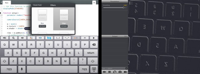
35 lines of code, readily adapted from the tutorial apps, generate this image processing edge detector, capable of recording both photos and videos. Add an $8 microscope lens like in this paper, or build this simple adapter for an existing microscope, and you have a setup capable of doing some serious science with your students.
Pythonista
While Lua is a very nice programming language, it is not my absolute favorite when it comes time to delve deeper into the beauty and power of computer science. That honor goes to Python, an elegant programming language, with good computer science components and practices baked into its structure. It is reasonably easy to learn for beginners, while also actively used for serious research across a broad range of disciplines. There are several implementations of Python on iOS, but my current favorite is Pythonista. Its interface is well-designed, although not quite as efficiently as Codea’s. Mobile features are also not quite as good as Codea’s, but still more than powerful enough. As with Codea, standalone apps can be readily generated. The built-in Python engine runs code swiftly and efficiently, and includes the Python Imaging Library (PIL) for powerful image processing. The main limitation of this version of Python is that some third-party libraries – notably NumPy and SciPy – have not been ported yet. This can hamper its use for some heavy duty computational tasks, particularly in the sciences.
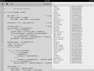
Taking an example from the social sciences, any serious discussion of electoral systems with students should include tools for measuring voting power, such as the Banzhaf power index. This index, while simple to explain, can prove time-consuming to compute. My Python code makes short work of analyzing even the trickiest setups on the iPad.
techBASIC
While the two previous alternatives make good use of the mobility features of the iPad, the undisputed champion in using the iPad’s sensors, as well as in connecting it to external devices and visualizing and analyzing the resulting data, is techBASIC. BASIC is less “modern” in its design than Python or Lua, but is still a good beginner’s programming language, particularly in versions such as this one that implement the best of Kemeny and Kurtz’ design principles. Since BASIC has been around for a long time, there’s a wealth of free code libraries available for it. The coding interface is serviceable, if less developed than Codea’s. techBASIC code can be compiled into standalone apps, but there’s a catch here: you have to pay a separate one-time fee for the required libraries.
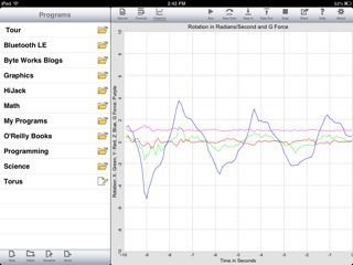
After a few minutes of studying the supplied sample code, I was able to write this app that could be used by students to study the physics of roller coasters on their iPad. Disclaimer: I did not ride a roller coaster while testing this app, just my desk chair.
Honorable Mention: Snap!
For many beginners, particularly young students, visual programming languages that require little to no typing provide a particularly powerful introduction to the tools of the craft. Scratch is one very popular implementation of this approach, but it does not run on the iPad. However, an enhanced clone developed by a team at UC Berkeley, Snap!, does. In my testing it performed well – all the Scratch code I input ran smoothly. Additionally, the features added by UCB to the original Scratch set mean that more advanced programming topics can be tackled with Snap! than with Scratch. Snap! currently only runs in the browser and requires a network connection, and does not make use of any special iPad features, but despite these limitations deserves serious consideration as a first intro to programming for students.
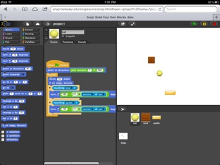
The “Basic Breakout” tutorial demo from my Game and Learn series, running in Snap!
Oh What A Tangled Web We Weave: Interactive Storytelling Using Twine
The slides for my presentation at the 10th Annual MLTI Student Conference are now online:
Oh What A Tangled Web We Weave: Interactive Storytelling Using Twine
The Twine tutorial game described in the slides can be played here, and downloaded here.